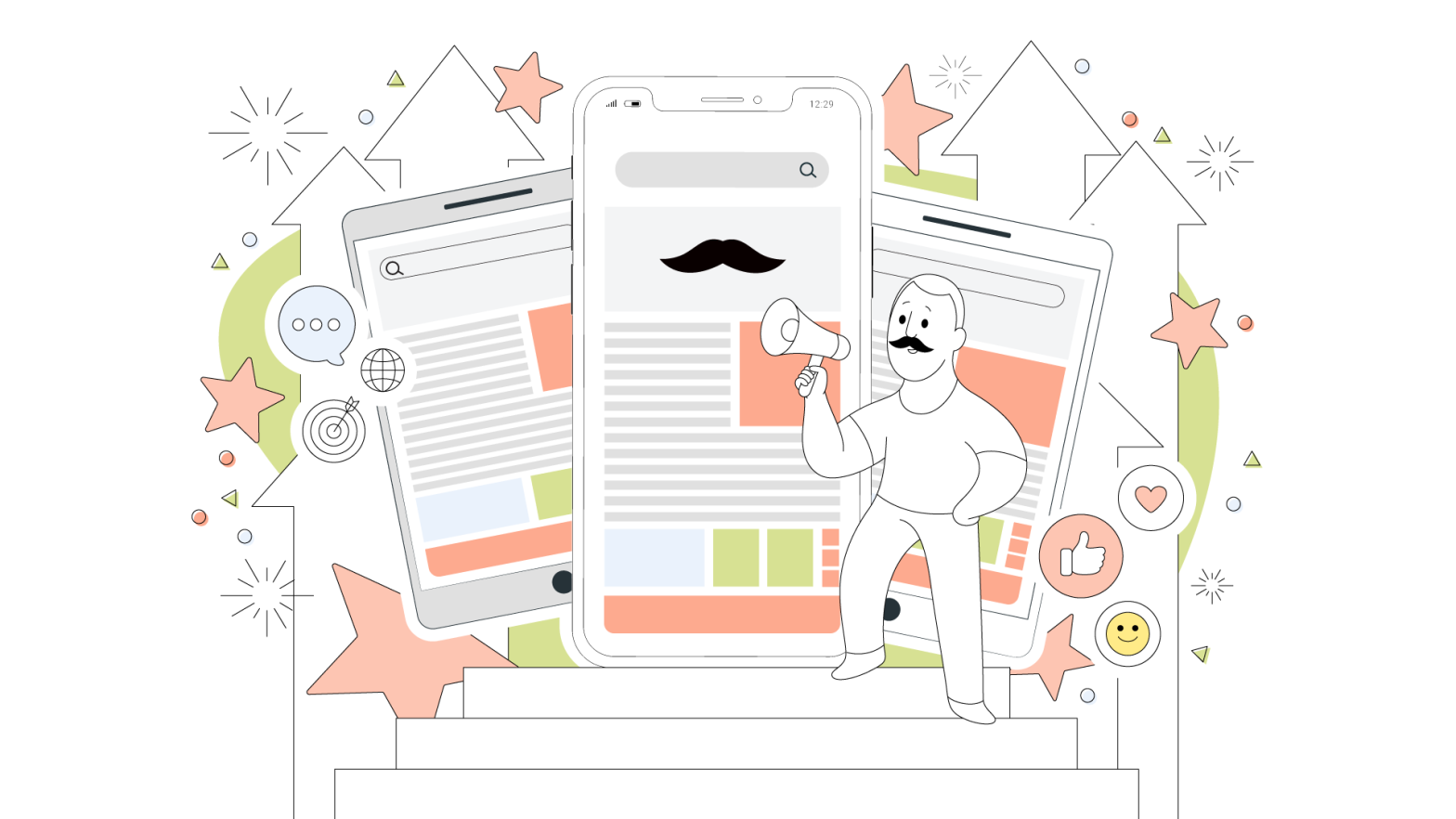
You can spend a lot of time to make your website look beautiful. You can design the most dazzling layout, add the most beautiful pictures you can find, put in elegant typography – and do more to make your site look great.
Your website can look beautiful. But how do you make it feel beautiful as well?
By using animations.
Animations are what makes your website come alive. If done properly, they can turn using your website into a delightful, magical experience.
But, there is a right way to use animations, and a wrong way.
If implemented incorrectly, animations can cause confusion, discord and chaos. Instead of attracting people to your website, they can alienate them.
This article will explain how to use animations the right way, so that you can create a website that not just looks beautiful, but feels beautiful as well.
Let’s get started.
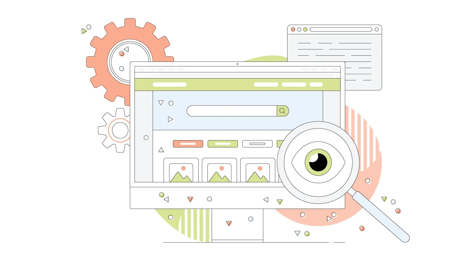
Why You Should Add Animations To Your Website
You shouldn’t think of animations as an afterthought. They aren’t something you add to ‘spice up’ your website’s design. While they do do that, their purpose and role is much more than that.
You see, animations show the user how information is flowing on your website. They help your visitors understand better how your website works.
Here are a few of the many reasons why using website animations is a great idea:
1. To create fluid motions: Usually, when you click a button, or a link on a website, it instantly opens up the next page, form or whatever it was designed to open.
With animations, you can create a slide-in or a pop-up transition, so that users can see the resulting page appear. This is especially useful if your website has a ‘tabbed’ interface.

2. To provide context: Let’s say you have a lot of content on your website which requires a user to scroll down to view more of it.
To give readers a hint that they have to take this action, you can animate your content to slide upwards on the page. This way, anyone will get a hint that there might be more content if they scroll down.
3. To give feedback: Animations can be especially useful if you have a lot of interactive elements on your website. For example, you can animate a button when a user hovers their mouse over it to signal that this is clickable. Or you can brighten the field a user is typing in in a form on your website.
With this kind of animations, your website will be more convenient to browse as it will provide feedback based on how people are interacting with it.
4. To tell a story: If your website is pretty complex and you’d like to give a tutorial to visitors on how to use your website, you can use animations for that.
In addition, you can also use animations for notifications, to provide comic relief during errors like 404, and for any other purpose you want.
5. To show progression: If your website needs to show progress, for example, in time, as a loading bar or something else, you can use animation to make it come alive to show that these elements are progressing in real-time.
Knowing this, you’ll be able to decide more effectively which animation to put where on your website.
Pro-Tip: Add Your Animations in the Initial Wireframe
If you are designing your website yourself or have hired a designer to design it for you, you can add the animations to the wireframe.
It can be as simple as noting down whether you want the images to slide in, the text to fade in as the user scrolls, or a button to zoom in when the cursor hovers on it.
The 12 Principles of Animation in Web Design
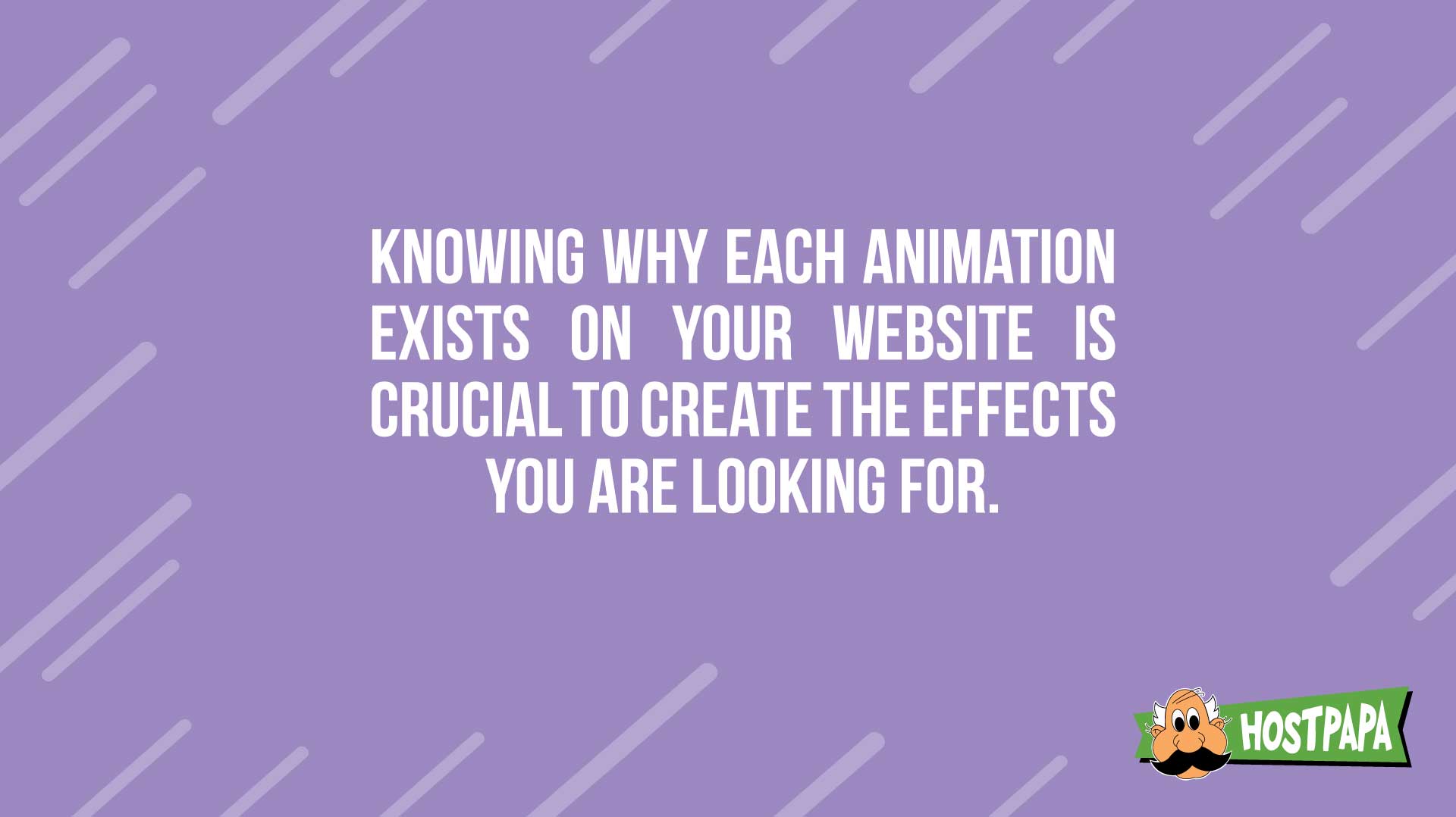
As with any decision, you should know why you are making it. Why does X animation need to be put on Y element on your website?
Being aware of why each and every animation exists on your website is crucial to create the effects you are looking for. Otherwise, you’re not animating your website to create a delightful experience, you’re just creating a nonsensical animated movie.
To prevent that from happening, in this section we’ll talk about the 12 principles of animation in web design.
They are based on the principles written in the highly popular book “The Illusion of Life: Disney Animation” by Frank Thomas and Ollie Johnson, whose ideas are still being used widely to this day for all kinds of animation.
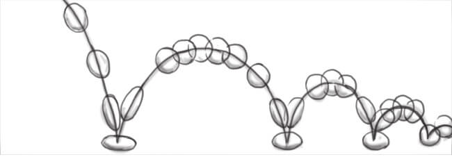
Image credit: Studio Practice
Principle No. 1: Squash and stretch
This animation principle indicates that if you want your objects to look life-like, give them a feeling that they have a mass. The way you can show that is by ‘squishing’ or ‘stretching’ an object when it interacts with another object.
For example, you can animate the buttons on your website so that they shrink upon clicking, or that a menu item or a link grows bigger when you hover over it.
This animation principal can be used when you want to show your visitors that they can interact with an element on your website.
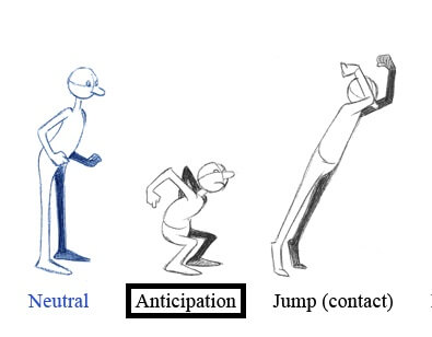
Image credit: Steam Community
Principle No. 2: Anticipation
You might have noticed that on some websites things happen kind of abruptly. You click a link and you instantly move to a different section of the website. Or when you click a button, a popup instantly appears in front of your face or a video starts playing.
If this happens on your website, it can come across somewhat alienating.
To solve this, you can add ‘anticipation’ animations to your website. These animations ‘ease in’ your visitors to the places they want to go or the objects that come in front of them.
For example, if a person clicks a link to go to the next page of your website, you can animate it so that the content slides in from the left or right, showing your visitors that they just went a page ahead. Or if you have a popup, you can ‘ease it in’ by animating it to fade in on the screen.
Image credit: Madnats
Principle No. 3: Staging
Sometimes, you want people to pay attention to a specific element on the screen, like an article section, a Subscribe button, or a donation box. To do that, you can do what’s called staging.
In staging, you can do two things:
- You can mask the rest of the elements to highlight the one you want. For example, you can blur the rest of your website while the element you want the person to pay attention to comes into focus.
- You can animate the element to move while the other elements stay static. For example, if you have a subscribe button or a donate button on your website, you can animate it to shake a bit or move so that a person’s eye is drawn to it.
By moving the main element or by fading the background elements, you can ‘put on stage’ whatever you want people to pay attention to.
Image credit: Alan Becker Tutorials
Principle No. 4: Straight Ahead Action and Pose to Pose
There are two ways you can design animations:
Pose to pose: This approach includes drawing out the keyframes of the animation while the frames in between are filled by the web browser itself or by an assistant.
Straight ahead action: This approach includes drawing every single frame of the animation until you get the full flow of the animated object.
Image credit: Animdesk
Principle No. 5: Follow Through and Overlapping Action
This animation technique, like the ‘squish and stretch’ animation, can be used to add realism to elements on your website. It dictates that not all objects start and stop at the same place.
For example, suppose you have a comments box on your website. You can animate it so than new comments slide from above, drop down and bounce a little before coming to a halt.
Or suppose you have a list on your website, with new information coming in regular intervals. You can animate the list so that when a new item comes in, it slides in from the left, moves a bit far to the right, and snaps back into place.
This adds a feeling of realistic movement in elements on your website.
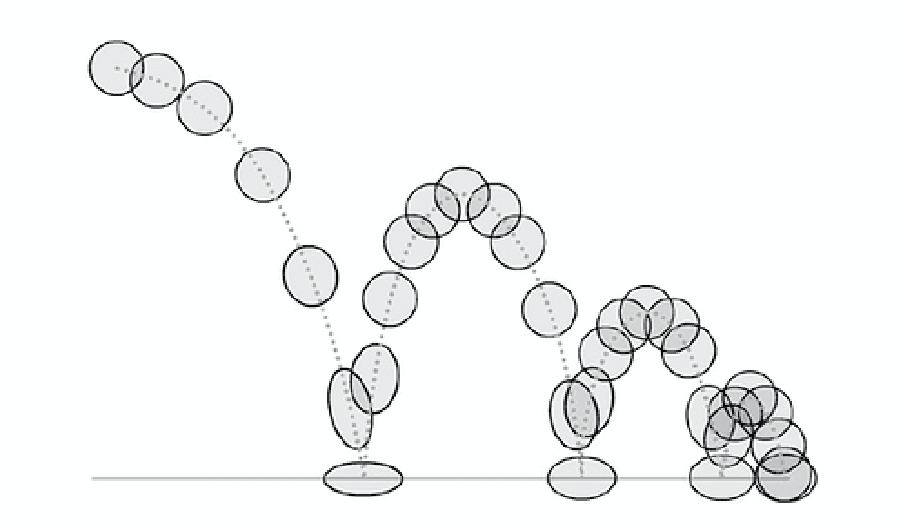
Image credit: Idea Rocket
Principle No. 6: Slow in and Slow out
In real life, things do not start (and stop) moving in uniform speed. They usually gain pace first, move, and then slow down before completely stopping.
You can animate elements on your website to achieve a similar effect.
For example, suppose your website has a loading bar. You can let it flow in uniform speed. Or if you want it to look and behave more life-like, you can animate it to slowly increase its pace and slow down as it moves to a halt.
This type of animation is called ‘slow in and slow out’.
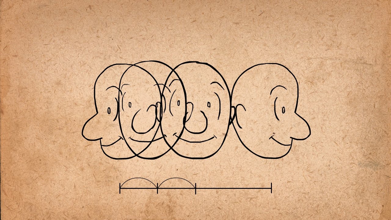
Image credit: Alan Becker Tutorials
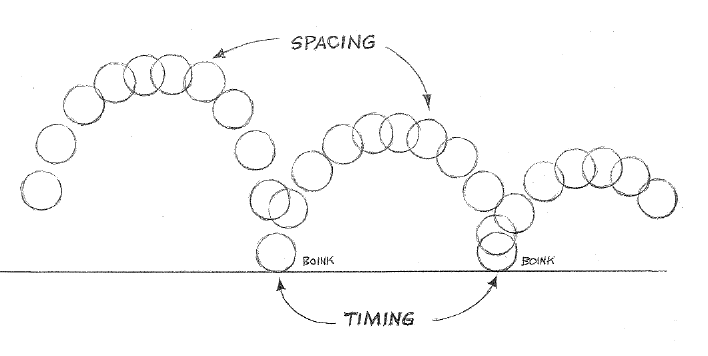
Principle No. 7: Arc
When an element, like a comment or a pop-up box appears on a website, it doesn’t have to just come up. You can make it bounce into view before it settles down.
Or suppose you have a feed of content which constantly updates from the top. Instead of just sitting there, it can bounce into view.
The animation in this principle looks and performs exactly like how a ball would bounce on a flat surface.
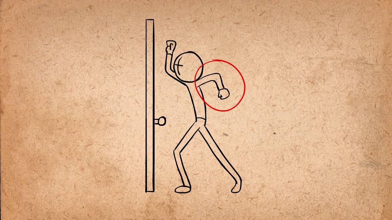
Image credit: Alan Becker Tutorials
Principle No. 8: Secondary Action
Secondary actions are the animations which can be used to complement the primary animations. For example, suppose you drag an item into a list. To make space, the list items above and below move away. This kind of animations are called secondary actions.
Imate credit: Hallucination Rain
Principle No. 9: Timing
Timing is an important part of any animation. It’s how a long an animation takes to fully play out. The faster the animation, the lighter the object will feel. The slower the animation, the heavier it will feel.
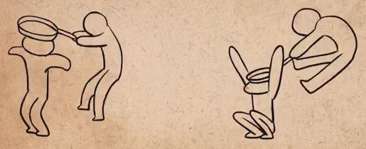
Image credit: Alan Becker Tutorials
Principle No. 10: Exaggeration
Exaggeration is a great animation technique which can be used to add weight to certain elements. It is a really great way to put emphasis on an element on your website.
For example, let’s say you want to highlight the menu item that a person has clicked. To exaggerate that, you can make it grow bigger when a user clicks on it.
Similarly, suppose you want to highlight a field in your forms that the user is currently on. You can animate it to zoom out to get the desired effect.
Image credit: John Hannimation
Principle No. 11: Solid Drawing
If you really want to bring the elements on your website to life, you can create three dimensional versions of them – and animate them when a user interacts with them.
For example, suppose someone hovers over an image on your website. You can animate it so that it flips over and people can see content that’s on the other side. These kind of animations are called solid drawings.
Image credit: D’source
Principle No. 12: Appeal
The last principle, called the ‘appeal’, means how the overall website feels to use with all the animations combined.
Do they present the information the way the web designer intended? Do your users get the ‘story’ or ‘direction’ your animations are trying to tell? Does it all tie in together and add to the experience of browsing your website? Combined, it all forms your website’s appeal.
What Not To Do When Adding Animations To Your Website
Up until now, you’ve learned what you can do on your website and what you can’t. Now it’s time to learn a few tips regarding what not to do when adding animations to your website.
- Don’t Make Your Animations Too Fast (or Slow): If you website animations are too fast or too slow, it can confuse or frustrate your visitors. You want to optimize your animations so they flow in a speed that’s perfect for the user.
- Use Fast Animations When Users Expect Action: When your website visitors click on a link or a button, or do any action after which they expect your website to respond – use fast animation in that response.
But if you want something unexpected to come up, use slow animations to give time for the users to process that unexpected element or content.
- Don’t Add Unnecessarily Flashy Animation: Weirdly shaped, brightly colored and popping animations can look childish and out of place on your website. If your animations don’t organize the flow of information or feel excessive, don’t use them.
- Don’t Add Animations That Hog Resources: Animations take extra RAM and processing power – and can cause your website to load slowly if you don’t take care of it. This is especially true for gradient and shadow heavy animations.
Don’t add any kind of animations that don’t do something useful on your website. If they are just there because you want them to be, chances are they will have a bad effect on the experience of using your website.
Do you use animations on your website? Do you think it enhanced the overall user experience?