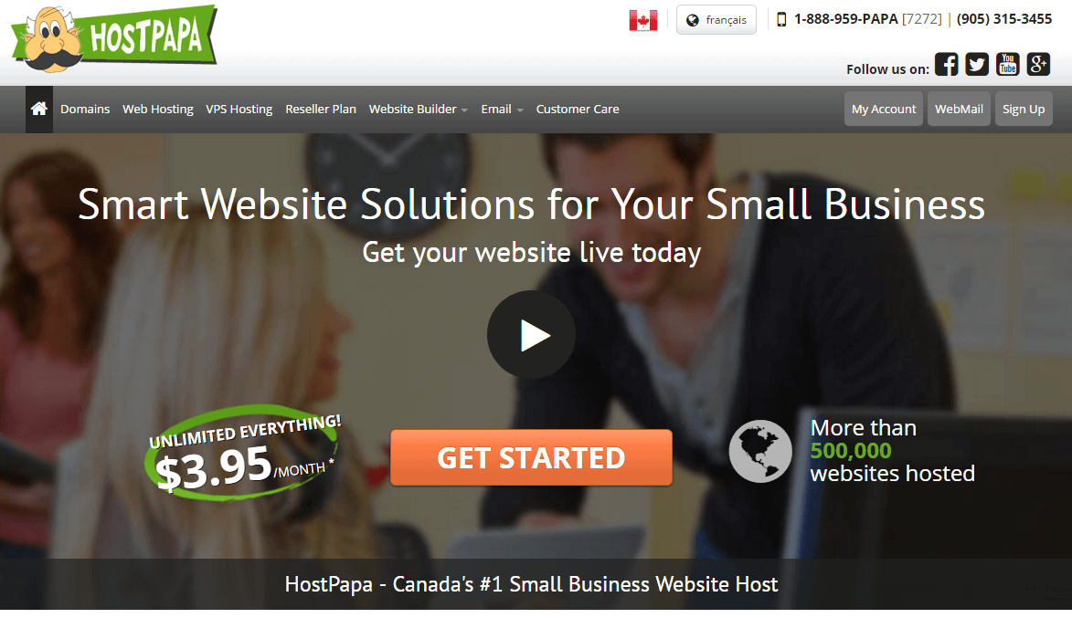
Making a good first impression is everything in the online world and the majority of the time that impression will come from your website’s homepage. It only takes a visitor half a second to form an opinion of a website, so you need to make sure that you present them with a homepage design that is worth looking at. If you present visitors with a bad experience 88% of those visitors are less likely to return to your business website.
On the flip side, having a successful homepage design for your website can be incredibly beneficial to your business. That’s why it’s important to design the best homepage that will catch your visitor’s attention.
Below we have listed 5 homepage design tips that your viewers will love:
1. Tell them who you are
The purpose of a homepage is to be a central hub where visitors can learn what your business is all about and find links to important features on your website. The first thing you’ll want to do is establish your identity and tell viewers how your business can help them.
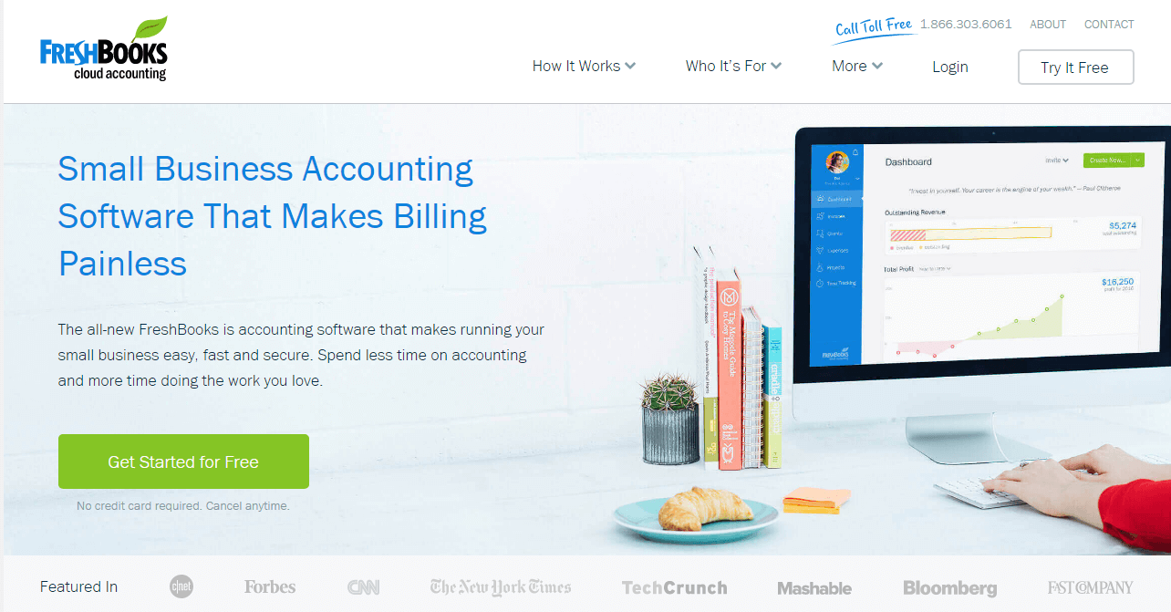
Take a look at the FreshBooks homepage. What grabs your attention first? The headline, “Small Business Accounting Software That Makes Billing Painless”. The headline tells visitors exactly what FreshBooks does, who it’s for and then they give links for more information without making the web page feel overwhelming or cluttered.
When working with your own homepage design you will want to create a headline that catches visitors attention. Place the headline in a place where people will see immediately. Also, make sure the headline is big and in a tasteful font that matches the rest of your theme. Viewers typically only read a quarter of the information on a web page so make your engaging content count.
2. Keep a clean consistent design
If you look at many of the most successful websites they all have many of the same features. That is because these features have been proven to generate interest from visitors. For example, the logo for your business should be located on the upper left-hand corner of all of your web pages. Also, viewers of your website will be expecting to be able to click the logo to return to your website’s homepage.
Some other things that you’ll want to include on your homepage are:
- Contact information: A phone number, Email, or address are all helpful pieces of information that will let people know you are running a professional business.
- Navigation: Your homepage needs to lead somewhere. Having tabs that lead to different pages will help visitors navigate your website. Make sure you don’t over clutter your homepage though, as 38% of visitors will stop engaging with a website if the layout is unattractive.
- Call to Action: A call to action is important on every web page. As you can probably ascertain from the name, it causes visitors to take action. That action can be selling products, signing up for a newsletter, or subscribing to any kind of service. Your Call to Action needs to be noticeable and not buried down the page. Place it soon after your headline, preferably standing out from everything around it.
- SEO oriented content: You won’t have a whole lot of content on your homepage, so the content you do have needs to be filled with keywords and phrases to help you rank high in search engines. Research has shown that 93% of buying cycles start with an online search.
3. Have clear objectives
Every homepage needs to have clear objectives that you want your visitors to follow. One obvious objective for your homepage is a call to action, but there should be more objectives on your homepage leading visitors to other pages on your website.
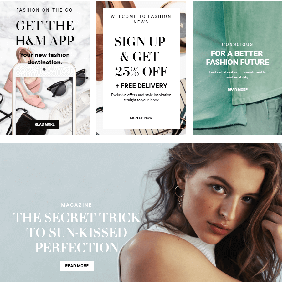
Take a look at the homepage for H&M Canada. They do a great job of presenting a lot of information without making their website feel cluttered or overwhelming. H&M does this by separating all of their information into panels, with each panel having a different objective that will lead to a different area of their website. One panel leads to a coupon, another leads to information on their app and another one will let you know about their initiative for better community sustainability.
Make sure that your call to action that sells your product or services is the most apparent objective on your page. After that there is still plenty of space to fill, so you can add some more objectives that will lead your viewers to other areas of your website.
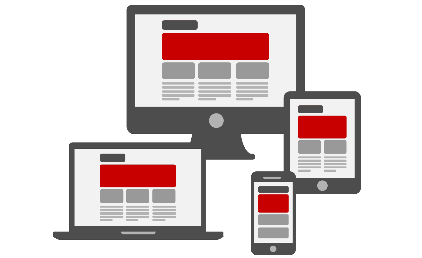
4. Optimize your website for all devices
One of the most frustrating things a website visitor can witness is trying to load a website that has not been optimized for the device they are using. This can be a common occurrence for companies that have not optimized their website for mobile devices. Analytics from Google have shown that 61% of users are unlikely to return to a website that they had trouble loading or viewing on their mobile device.
Most website builders or web page templates come mobile ready, so in this day and age there really is no excuse to not have a mobile friendly website. Check your website on multiple devices for mobile and tablet friendliness. If you find your website unresponsive you’ll need to upgrade or else potentially lose around 40% of your visitors to a competitor’s website.
5. Choose the right images
In the digital age that we live in, high quality has become something that is expected of every website that is created. This means choosing high-res, high-quality photos to place on your website. 37% of marketers have said that visual marketing is one of the most important forms of content for their business, second only to blogging.
It’s also important to optimize your images as 39% of visitors will stop engaging with a website if the images won’t load. You can try and use stock photos but it can be difficult to find any that match the message you are trying to send for your company. You are better off getting your own photos to use on your website. Just be sure the photos you use are of a high quality. If you have to it might be worth hiring a professional photographer to get the perfect images for your site.
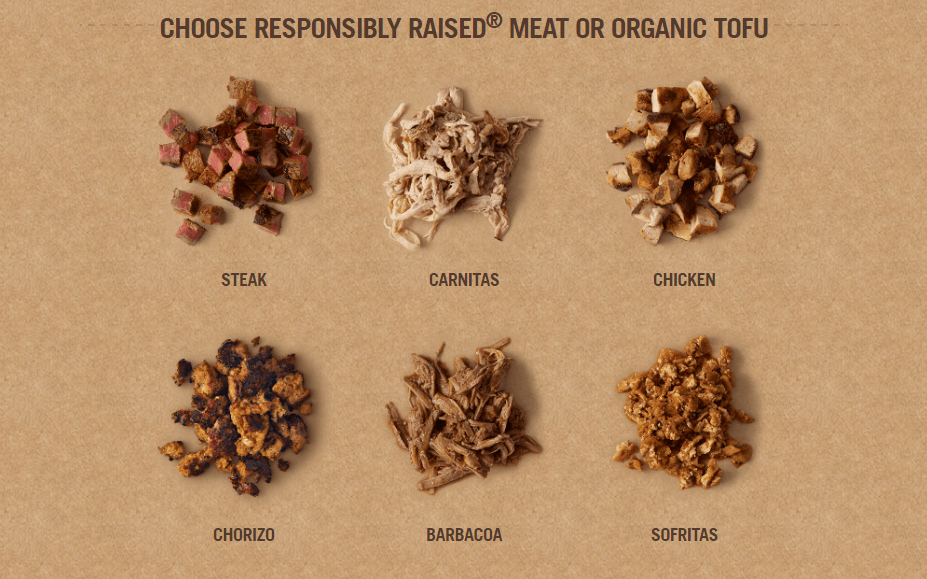
When you look at a website like Chipotle you will see that all of their images are professionally taken, from the homepage down to their ingredients. If there is one thing you can learn from Chipotle’s web pages it is to pick photos that grab visitors’ attention for your homepage and using professional photos throughout your website. For more information on taking professional product photos take a look at this HostPapa article.
Your homepage is the entry portal to the rest of your business so make sure that you leave a lasting impression when people decide to visit. You have a short window of opportunity to grab a reader’s attention and keep it. Make sure your website is cleanly designed and filled with professional images and high-quality content.
Let us help you build the perfect website with our hosting plans that are tailored for businesses of all sizes. For all of your small business needs, make sure to check back on the HostPapa blog.